Marder III
The following article is one of my earlier works published; I was extremely pleased to be not only published by Fine Scale Modeler Magazine – 2009, but the Marder III was featured on the front cover. As I go about rebuilding my site and reading these older posts I am struck by how my style has changed over the years – both in writing and modeling. The topic of conversation is the “new” Modulation Style of painting – those familiar in the modeling world have seen and experienced the varied opinions of the technique as it has been used and developed over the subsequent years.

One challenge I have when working on a project is how best to capture the look and emotion of the image that I have in my mind. Over the years finishing techniques have evolved, new techniques have been tried in the pursuit of capturing these ideals. Recently, my friend and colleague Adam Wilder began pushing the boundaries of light and shadow, contrast and color in a style he terms Color Modulation. While the idea of forcing shadows and creating interest by differing colors and tones is not necessarily new, Color Modulation dictates carrying these principals almost to the extreme. In all honesty, I have been content to be a skeptical bystander of the style. While I believed that the style had merit, I wasn’t sure if I subscribed fully to its doctrine. Over my past few projects, however, I found myself slowly and subtlety experimenting with some of the principals of Color Modulation. My small steps seemed to yield positive results, so after a few baby steps I felt ready to take the big step and attempt a complete finish in the principals of the style. The subject for my Modulation experiment is the new 1/48 Tamiya Marder III with the addition of Hauler’s photo etch update set.
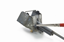
This is my 2nd foray into the 1/48th world and I must say that I’ve been truly smitten with the quarter scale kits, they really are fun. The construction was fun and easy, as Tamiya has produced a very nice, builder friendly kit. Hauler is to also be commended for offering a very smart update that includes only those items that will enhance the vehicles
|
|
|
|
|
|
|
|
|
|
|
|
appearance without unnecessary bits and fuss. In a few short hours my kit was completed and I was ready to embark upon the painting and finishing; the Color Modulation experiment.
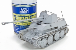
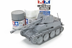
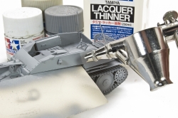
I decided early on that I would keep it simple and would be painting my Marder in a basic grey finish. For me, the painting process begins with a good undercoat and Mr. Surfacer performs this task brilliantly, especially in those circumstances when the finished kit contains mixed media. All of my base painting was done using Tamiya paints. It is important to notice that I thinned my paints using Tamiya Lacquer Thinner. I have heard discussion that the Tamiya acrylic paints are not true acrylic paint and modelers have experienced good results having switched to using lacquer thinner. I gave it a try and will say that the difference when using lacquer thinner is amazing. Paints from the XF range spray much smoother allowing me to paint in a much more controlled manner which is so important to this style. My thinning ratio is approximately 20% thinner to paint, but admittedly I’m more of a look and feel person so the exact proportions may very slightly.
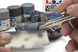
Although I would be trying something new and pushing my boundaries by applying the principals of Color Modulation I did not feel it necessary to abandon my own techniques entirely. As is my usual, I begin painting with my base colors being many shades lighter than what I envision my final presentation to be. The reasoning is simple; later weathering procedures will always darken the finish colors. Keeping everything on the lighter side to begin with allows me the flexibility within which to work the lights and shadows. My base grey color would be a mix of Tamiya XF-54 Dark Sea Grey and XF-2 Flat White in a 50-50 ratio thinned with lacquer thinner. This is airbrushed over the entire vehicle as the overall base color.
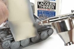
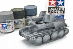
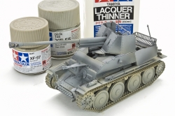
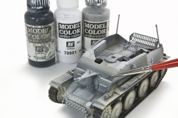
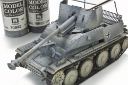
You will notice as the process unfolds and the shadow colors are applied this lightest color becomes the lightest highlight color. For the mid-tone color I added XF-55 Deck Tan to the base color at a ratio of 50-25-25 (grey-tan-white). It’s at this stage that the style dictates that a light source be determined. In the more extreme examples of the Modulation style light emanates from a low angle, (picture the light from the setting sun), producing stark light and shadow contrasts. In my case, however, I chose to stay close to my own style and follow the dictates of our figure painting friends by producing a light source as emanating generally from above. Consistent with this approach, the lightest colors would remain on the upper surfaces while I would force deeper shadows and contrasts using the Modulation techniques. The mid-tone color was my first opportunity to begin to create the jarring separations of panels and surface elements characteristic of the style. Using a the edge of card stock as a masking tool I went about defining certain areas using the mid-tone color, always being mindful of not over spraying the highlight areas. Subtly at first, I noticed the sense of volume and weight increase on my Marder as I purposefully, even playfully exaggerated the shadowed surfaces and defined the panel edges. The third layer, the deepest color layer, is by far the most dramatic. For color I mixed Tamiya XF-54 Dark Sea Grey (70%), XF-63 German Grey (20%) and XF-18 Medium Blue (10%), as always thinned with Tamiya lacquer thinner. Once again using card stock as a template or mask I went about the Marder adding the deepest color layer to the lower edges and corners. You may notice that on the turret I purposefully “reversed” the light and shadow colors on certain panels with the darker on top and lighter on bottom just to see what the effects would be. After all, this is an experiment.
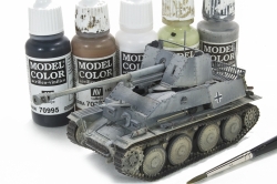
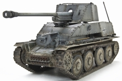
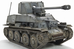
There are certain areas that I would like to point-out as good examples of the Modulation principals being applied. First, the curved front glacis plate under the gun has an exaggerated roundness due to the extreme highlight on the upper surface that turns quickly to the deepest shadow as it rolls to the front. Other areas of note are the side armor where the use of masking has produced stark contrast and separation between the various plates. And finally, the road wheels have a decidedly top to bottom shadow further accentuating their shape and the concept of an overhead light. The accompanying photographs show the starkness that can be associated with the Color Modulation style. At this the appearance of the looks to be more akin to a computer generated or science fiction subject. Interestingly, the principals of the style call for even further contrasts be added using the brush to the smaller surface details. So in keeping with the doctrine I picked out the smaller surface details such as hinges and edges with light grey colors using paints from the Vallejo Model Color range. This is a far cry from the final appearance that I have in my mind’s eye. So now what? The final piece to the Color Modulation style is to tone it down and tie it together via the weathering process. With a nice modulated base I felt free to revert to my usual weathering practices. The first step is to seal the base with a light mist of Future acrylic polish as there is no doubt that I can be aggressive with my weathering and I feel that the protection is necessary to protect the base colors. Directly over the glossy finish I begin the process of adding chips and wear using lighter and darker grey and brown color paints using Vallejo acrylics.
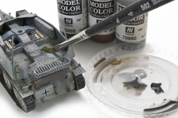
Chips and wear are one of those topics that can incite a healthy debate. I feel that some level is necessary to make the vehicles “look right”. I realize that it is a subjective, but for me the chips and scratches help give vehicles character and definition, of course if done within the proper context. To create my scratches I use a technique that I call “dancing”. In this method, rather than paint each scratch or surface mark individually I quickly and lightly (as in dancing) pass my brush over the surface, sometimes it touches, sometimes not. I do this with a number of times, each pass with a slightly different color using a crisp 000 brush. When finished, I have a multitude of light, somewhat random marks or scratches on the surfaces. During the subsequent weathering some of these marks will fade while others will become more pronounced. Harmonization of the stark base color certainly begins with the application of color filters. On this project the filters consists of much diluted of bluish/grey and browns mixed from Vallejo Model Color paints. I apply the filters one panel at a time using a soft brush, paying attention to vary the color of each panel slightly. This step is repeated until satisfied with the appearance. Further color depth and surface fading was done using artists oils. MIG Productions 502 Abteilung Shadow Brown was employed to refine the panel lines and add deep shadows to the interior corners. Small dots of artist oils were applied to the exterior panels to achieve paint fading. In keeping with the principals of Color Modulation I purposefully applied darker dot of blues and grey over the darker base color, while applying light buff and white to the lighter areas. The techniques I prefer when applying dot filters is to pre-moisten the surface with turpeniod then work the artist’s oils into the surface using a soft brush. It is very important that each application be allowed to dry completely as the effects will tend to intensify upon drying. As with the acrylic filters, the oil filters and fading can be repeated as desired. Finally, I regained some of the panel definition lost during the processes by applying selective pin washes using the Shadow Brown color. Getting down and dirty is the final step in my weathering process. Actually, for me it is a two-step process. In the first step I weather the entire vehicle using artist oils. In this case I used the excellent MIG Productions 502 Abteilung Dark Mud, Light Mud, and Buff colors. I begin by working the darkest colors into the corners and edges of the areas where I wish to show the heaviest dirt accumulations.
A reminder that when working with artists oils it is important that you allow each layer to dry before proceeding with the next. A hairdryer set to low can speed the drying time. On this piece a number of additional color layers were applied always repeating the same procedure of working from the corners and edges toward the middle. Using these same colors I also applied the subtle rain and dirt streaks at varying locations, again, a slow process that requires a little time and patience. The second step of the dirt process is the application of MIG Productions pigments. As on any project I try to limit my color palate to a few primary colors, and then use these to mix varying shades. This project my primary pigment colors were Rubble Dust, Dry Mud, Russian Earth, and Beach Sand. As with the application of the filters and artists oils I find it particularly important to constantly vary the color mix as I proceed. As a rule I apply my pigments wet, having first been dissolved in turpeniod to the constancy of milk. Then, with a small brush I apply the pigments in much the same manner as I do the artist oils. I begin at the edges and corners and work toward the centers. Again, I feel that this procedure allows for a natural appearance to the build-up of the dirt and grime. As with the artist’s oils, it is important to allow the preceding layer to dry completely before moving on with to the next application. The final step was to once again regain certain panel lines and feature definition using a light pin wash.
|
|
Ok, so what do I think of Color Modulation? In my opinion Color Modulation, or at the least certain aspects and principals of the style have definite merit. On this project I particularly enjoyed pushing my boundaries of light and shadow to see where it took me; and I like where I ended up. Over time, modelers have developed a number of techniques to bring scale light, shadow and depth to their works. Whether it is in the form of dry brushing, pre-shading, post-shading, lightening the interior panels via airbrush, etc, all in the quest to capture the image present in our minds. Will Color Modulation supersede all these other techniques? Only time will tell, but for me I found the principals and techniques valid and I am certain that a form of the Color Modulation style will find a place in my personal bag of tricks.
